I’m certainly no Reporting Services master, and far from a Business Intelligence Developer, but I do like to tinker around with reports for the bosses from time to time
I like Excel for it’s conditional formatting feature, especially in building heat-map type charts.
So I was looking for a way to replicate the functionality in SSRS and figured I’d pass it on:
Just as an example, boss comes and asks “Hey, what’s the busiest time of day for our order-entry website?”
This is easily accomplished by changing the Properties of the cell ( in my case textbox2 ) Fill > BackgroundColor > and click on Expression…
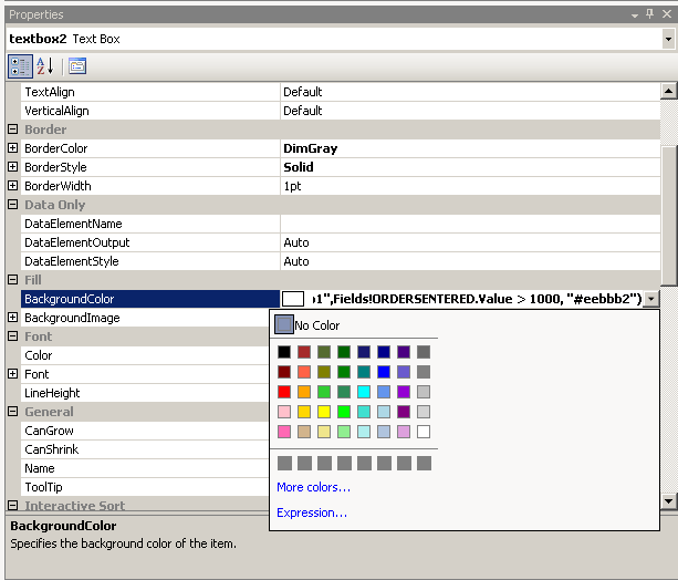

From here it is pretty intuitive… I select a color from the values field and using the SWITCH function can apply green for < 100, yellow for 100 – 500, red for 500-1000, etc.
I end up using the more colors link down right to select a visually appealing color range.

This technique can also be used to create alternating background colors that makes a report more readable as used here…

It’s not magic, but logic. However, as Andrea says “Have a magical day!”
